Explore BrainMass

Explore BrainMass

    Box Plot

    A box plot, also referred to as a box and whisker plot, provides an illustrative representation of the differences between groups by graphing the numerical data for each group using quartiles. Essentially, a box plot represents a way of presenting the first, second and third quartiles. As the title implies, a box plot figure is composed of rectangular boxes and it also includes lines which extend from the box (which represent the whiskers) to illustrate the spread of the data. Figure 1 below presents an example of a box plot for an ecology based study.

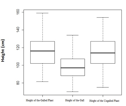
    Figure 1. This is a box plot which displays the height variable data for the galled plants, the gall and the ungalled plants (note that the height of the gall is a measurement taken from the ground to the bottom of the gall structure). The black bars in the box structures represent the median value, the bottom line of the box to the black line represents the first quartile and the black line to the outer box line represents the third quartile. The dashed line extended vertically from the box (both on the bottom and the top) to the solid horizontal line, represents the extent of the area where outliers are found.

    As described in the figure caption, the rectangular boxes present all three quartiles. Note that the first quartile is equivalent to the 25th percentile, the second quartile is equal to the median or 50th percentile and the third quartile is analogous to the 75th percentile. Thus, box plots are very useful statistical figures, specifically when wanting to graph the median and the entire spread of the data.

    In comparison to other statistical figures, box plots provide a method of comparing the variation which exists in a data set which is comprised of more than one independent variable. Although a box plot can be used for only one variable, it is often used to present numerous related variables on the x-axis at one time. Box plots are commonly used in the study of statistics and understanding how to interpret them is an important skill.

    © BrainMass Inc. brainmass.com March 28, 2024, 7:49 am ad1c9bdddf

    BrainMass Solutions Available for Instant Download

    McGivern Jewellers - Box Plots

    McGivern Jewellers is located in the Levis Square Mall just south of Toledo, Ohio. Recently it ran an advertisement in the local newspaper reporting the shape, size, price, and cut grade for 33 of its diamonds currently in stock. The information is reported in the attached Excel file. (Please see

    five number based box plot

    A store manager has collected data on purchases from weekdays and weekends. Here are some summary statistics (rounded to the nearest dollar). Weekdays n =230 Min=4, Q1=28, Median=40, Q3=63,Max=95 Weekend n = 150 Min=10, Q1=35, Median=55,Q3=70, Max=100 From these statistics construct side by side boxplots and write

    Normal Probability Plot and Box-and-Whisker Plot

    Please see attached file for full question. Data File HEMLOCKFARMS contains the list price of 61 homes that are for sale in that community. a. Construct a normal probability plot of the list price data. Do the data appear to be approximately normally distributed? Explain your answer. b. Construct a box-and-whisker plot

    Box and Whisker Diagram to compare salaries of researchers by gender

    See the attached file for Box and Whisker Plot. With reference to the box-and-whisker diagrams, compare the salaries of the researchers selected in your sample, by gender. Ensure that you comment on the skewness, the median, the interquartile range, the minimum and the maximum values of both diagrams.

    Box Whisker Plot in EXCEL

    Please refer to the attached file for data. Please produce a single, labelled graph with 2 separate box and whisker plots of the height data for male and female students. Write a short paragraph that describes what the graph shows. An example is provided below. All scientists, in any of the many disciplines, spend a great

    Statistics - The Chips Ahoy! 1,000 Chips Challenge

    Case Study: The Chips Ahoy! 1,000 Chips Challenge 1. Review the case study on page 359 of the textbook. 2. The data on the number of chocolate chips per bag for 42 bags of Chips Ahoy! cookies were obtained by the students in an introductory statistics class at the United States Air Force Academy in response to the Chips Ahoy!

    Construct a box plot and find IQR & interpret its meaning

    Q3) The following ranked data represent the number of English-language Sunday newspapers in each of the 50 states as of February 1, 1996: 2 3 3 4 4 4 4 4 5 6 6 6 7 7 7 8 10 11 11 11 12 12 13 14 14 14 15 15 16 16 16 16 16 16 18 18 19 21 21 23 27 31 35 37 38 39 40 44 62 85 Construct a box plot for the data. Characterize th

    Testing Sleep Patterns

    M = Mean S2 = Population Variance SM = Standard Deviation of the Distribution of Means t = score for your sample t needed = cut-off score that establishes the region of rejection (also known as the critical value) Decision: Reject the Null or Fail to Reject the Null (select only one) Evolutionary theories often emphas

    Statistics

    1. The ______________can be used to differentiate the "vital few" causes of quality problems from the "trivial many" causes of quality problems. A) histogram B) scatter plot C) Pareto chart D) box plot 2. Which display is most likely to reveal association? A) Dot plot. B) Scatter plot. C) Histogram. D)

    Box Plots to Compare Medians of Home Prices

    Determining if a mean price of a home with a pool is equal to the mean price of a home without will require the research team to calculate a score that will be compared with a critical value. A comparison of mean populations will allow the team to discover if the two variables vary significantly, which may answer many types of q

    Five Number Summary and Boxplot

    1) Lottery: Box plot the following numbers: 0,5,5,7,9 2) Movie Budget: Find the 5- number summary and boxplot them: 18.5, 72, 0.25,55, 10, 0.325, 70, 17, 8, 70, 25, 15, 6.4, 50, 100 3) Cereal Calories: Box plot the following numbers: 3.3, 3.6, 3.75, 3.95, 4.1 4) Nicotine: Find the 5 number summary and box plot them: 1.

    Parallel Modified Boxplots

    A researcher believes that modern golden retrievers may be related to a breed of wild dog called the Carolina dingo. A sample of 16 animals was collected from each of the two populations. The length (in millimeters) of the mandible (jawbone) was measure for each animal, and shown in the table below. Sample Values below Q1 Q1

    Boxplot and Five Point Summary of Newspaper Circulation Data

    Listed below is the average daily circulation for the 50 U. S. newspapers with the largest circulation. a. Find the mean, median, Q1, and Q3. b. Find the 15th and the 90th percentiles. c. Find the coefficient of skewness and interpret the result. d. Develop a box plot and interpret the result. Newspaper Circulation:

    Boxplot of Random Samples

    I need some help with these two questions, please show step-by-step with a box plot. Thank you in advance: 7.1. A study of 584 longleaf pine trees in the Wade Tract in Thomas County, Georgia is described in example 6.1. For each tree in the tract, the researchers measured the diameter at breast height (DBH). This is the diamete

    Normal Distribution, Mean Difference, and Boxplot

    Could you show me how to solve the attached problem #1. It's long, but it's still a basic statistics problem. It asks four questions: a) What is the sample distribution of "d"? b) What assumptions made in a) are checked by the plots? c) Calculate a 95% confidence interval for the difference, if 12 other points are