Explore BrainMass

Explore BrainMass

    Pareto Chart

    A pareto chart is a special type of bar graph, which incorporates the use of a line graph to represent the cumulative total of all the units being measured. A pareto chart is similar to a bar graph in how it uses vertical bars to record frequency or a specific quantity such as cost or time. However, this figure differs from a basic bar graph in terms of organization, since in many cases the bars are in consecutive order with respect to bar length (longest to shortest), includes a line graph and has two labelled y-axes.

    The principle behind a pareto chart is based from Pareto’s empirical law, which states that “any assortment of events consists of a few major and many minor elements” (1). Basically, a pareto chart provides a useful way to analyze the significance of different issues or problems. By presenting the data in terms of their order of frequency, this allows for the few major elements to be emphasized.

    The use of a pareto chart is particularly effective when trying to pin-point the most powerful or significant issues facing a process. Just as Pareto’s empirical law says, often there is a multitude of issues taking place, but in many instances, only a small number account for over half the total frequency (1). Below is an example of a pareto chart (2).

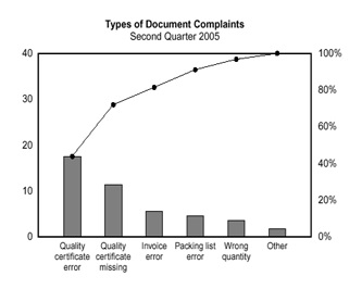
    Figure 1. This figure provides an example of a pareto chart modeling the frequency of different types of document complaints. By analyzing the figure, it is clearly evident that quality certificate errors and quality certificate missing issues represent the highest percent of complaints. The line graph represents the cumulative total of all the complaints and corresponds with the right-handed y-axis. This figure has been taken directly from: http://asq.org/learn-about-quality/cause-analysis-tools/overview/pareto.html.

    As can be seen from the above figure, pareto charts represent an effective method of identifying the major issues hindering a process. By modeling data using a pareto chart, a business manager or company worker can learn which issues need to be eliminated from a system in order to make a process more effective.

    References:
    1. Miller, I and Freund, J. (2011). Probability and Statistics for Engineers – 8th Edition. Pearson Education, Inc.: U.S.A.
    2. http://asq.org/learn-about-quality/cause-analysis-tools/overview/pareto.html

    © BrainMass Inc. brainmass.com March 27, 2024, 5:02 am ad1c9bdddf

    BrainMass Solutions Available for Instant Download

    Gas Prices, Compensation, and Cigarette Tax

    I have some practice problems my professor gave us to help us study for our big exam. I need help with a few of them. can you please help and show work, so that I am able to see how you came up with the solution thank you. :) Files are attached.

    Elementary Statistics

    A study among adults in the USA shows that adults prefer not to receive certain items as gifts on Valentineâ??s Day as shown below: Teddy bears: 45% Chocolate: 25% Jewelry: 15% Flowers: 12% Donâ??t Know: 3% Construct a Pareto diagram picturing the Presents not wanted

    Pareto Diagram: Bank Example

    Pareto Diagram. A local bank is keeping track of the different reasons people phone the bank. Those answering the phones place a mark on their check sheet in the row a most representative of the customers questions. Give the following check sheet, make a Pareto diagram Credit Card Payment Questions...............254 Trans

    Develop a Pareto chart

    The table below represents one month tracking of a hospital's administrative defects in the Emergency Room Cause # of Defects Time: Patient Wait Time Admissions 80 Time: Wait Time see the Doctor 16 Time: IT Down Time 12 Time: Health Insurance Confirm 7 Administrative Staff Errors 4 Time: Short Medical Staff 3 Me

    Statistics & Operations Management - Pareto Analysis

    Please complete the problem below: Develop a Pareto analysis of the following causes of poor grades on an exam: ------------------------------------------------------------------------- Reason for Poor Grade Frequency Insufficient time to complete 15 Late arrival to exam

    Pareto chart identifying key engine problems

    Out of 110 diesel engines tested, a rework and repair facility found 9 had leaky water pumps, 15 had faulty cyclinders, 4 had ignition problems, 52 had oil leaks, and 30 had cracked blocks. Draw a Pareto chart to identify the key problem in the engines.

    Pareto Charts and Key Problems in the Engines

    Out of 110 diesel engines tested, a rework and repair facility found 9 had leaky water pumps, 15 had faulty cylinders, 4 had ignition problems, 52 had oil leaks, and 30 had cracked blocks. Draw a Pareto chart to identify the key problem in the engines.

    Pareto Chart for Shoe Failure

    The manufacturer of athletic shoes conducted a study on their newly developed jogging shoe. Listed below are the type and frequency of the nonconformities and failures found. Develop a Pareto chart to show the major problem areas. Type of Nonconformity Frequency Sole separation 34 Lac