A pie chart is used to display categorical data as the area of divided sectors in a circular figure, representing each category as a proportion of the whole. In comparison to other statistical figures, such as bar charts, pie charts are most effective when comparing the numerical proportions of different sectors against one another, which together are part of a whole. However, pie charts are only able to present data at one moment in time and cannot illustrate changes which take place over time.
Consider the following scenario, in which using a pie chart is an effective tool to display the data. A desert shop owner wanted to know which of her cakes were most popular with the customers and so, she recorded all cakes purchased over a one weekend period (Saturday and Sunday) in July, to try and estimate which cake was the favoured option. Use the data in the table below to create a pie chart.
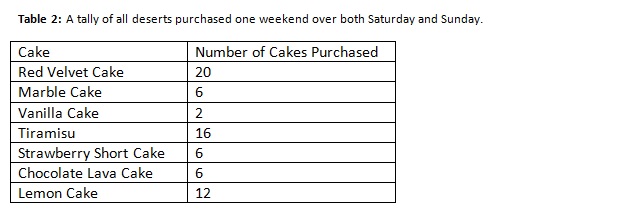
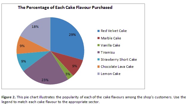
In a pie chart, all of these cake categories will be represented as percentages and thus, each category now needs to be represented as a segment of the total. In total 68 cakes were purchased. Now, calculate the percentages associated with each cake category.
Red velvet = 20/68 x 100 = 29%, Marble Cake: 6/68 x 100 = 9%, Vanilla Cake = 2/68 x 100 = 3% Tiramisu = 16/68 x 100 = 23%, Strawberry Short Cake = 6/68 x 100 = 9%, Chocolate Lava Cake = 6/68 x 100 = 9%, Lemon Cake = 12/68 x 100 = 18%
Figure 2 below presents a pie chart for this information which has been created using Microsoft Excel.