A histogram is used in statistics to visually present a frequency distribution for different category boundaries, through the construction and juxtaposition of rectangular bars. Histograms are very frequently used in statistics to visualize data because they provide an effective and simple method for presenting the frequency of particular values for a data set or independent variable. After constructing a frequency distribution, histograms are commonly the subsequent step in presenting the data.
Histograms are similar in appearance to bar graphs, but unlike bar graphs, there are no spaces between the bars of histograms. Additionally, histograms can be used to represent numerical data that is provided by intervals, which is common when graphing the data from a frequency distribution. Thus, each of the bars can be marked by boundaries.
Additionally, histograms are also used frequently in statistics to test for normality and inspect whether any irregularities are associated with the data. A test for normality indicates whether or not the data follows a normal distribution. A test for irregularities may analyze whether or not more than one pronounced peak exists within the data set for example.
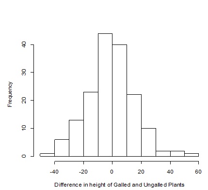
Figure 1. This is a histogram in which the differences calculated for the height between the galled and ungalled plants is plotted. These differences were calculated by calculating the height difference for the entire sample size (n=164) between the galled and ungalled plants. This histogram is used to test for normality.
Figure 1 above, presents an example of a histogram being constructed for an ecological situation. As is mentioned in the figure caption, this histogram was used to test for normality. From a quick visual inspection, the pattern of the bars, resembling a bell shaped curve, indicates that the data for the variable being measured follows a normal distribution.
© BrainMass Inc. brainmass.com May 2, 2024, 5:04 pm ad1c9bdddf