A bar chart is a statistical diagram which compares the numerical values for different categories through the use of either horizontal or vertical bars. Bar charts are an effective type of figure to utilize for comparing data sets and factual information. However, it is also important to realize that although relationships can be easily seen using a bar graph, it is critical to take note of the scale being used on the y-axis, since the scale can change one’s perception of the data.
Consider the following example: A grade eight teacher wanted to buy his new girlfriend tulips for her birthday, but wasn't sure what colour of tulips to buy. Therefore, he surveyed his class, asking them what they thought the prettiest tulip colour was out of four options. Using the table of results given below, present the following information in a bar graph.
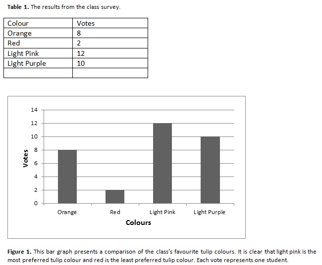
In this case, "flower colour" is the categorical variable and "votes" is the numerical variable. Furthermore, "flower colour" is the independent variable in this case and is plotted on the x-axis and "votes" is the dependent variable and is plotted on the y-axis. When creating a bar chart, make sure to label both of the axes and include units of measurement if appropriate.
Reference:
1. Comparing Graphs, retrieved from http://www.mathgoodies.com/lessons/graphs/compare_graphs.html
© BrainMass Inc. brainmass.com May 2, 2024, 6:43 am ad1c9bdddf